Reference
Including element.js
However you’re using element.js, you always begin by including the library and setting your API key. To get started, include this script on your pages — it should always be loaded directly from https://js.liquido.com/element-1.2.0.js. For testing purposes, you can use https://js.dev.liquido.com/element-1.2.0.js.
The Liquido Object
- liquido()
- liquidoInstance.elements()
- liquidoInstance.createToken()
Create an Liquido Instance
Create an elements Instance
Create pre-built UI components to collect payment information with Elements.
This method creates an instance of elements, which manages a group of Elements. It receives an options object. Available options are documented below:
| Option | Type | Description |
|---|---|---|
| locale | String | The IETF language tag of the locale to display placeholders and error strings in. Default is Spanish (en). Supported values are: en, es, pt. |
| country | String | User’s country code. ISO 3166-1 alpha-2 codes. |
| fonts | Array (Optional) | An array of custom fonts, which Elements created from the elements object can use. Fonts can either be loaded via a CSS file by passing an object with the cssSrc attribute, or they can be loaded directly by passing a Font object. |
cssSrc attribute
| Parameter | Type | Description |
|---|---|---|
| cssSrc | String | A relative or absolute URL pointing to a CSS file with @font-face definitions. |
The Font Object
| Parameter | Type | Description |
|---|---|---|
| family | String | The name to give the font. |
| src | String | A valid src value pointing to your custom font file. This is usually (though not always) a link to a file with a .woff, .otf, or .svg suffix. |
| display | String(Optional) | A valid font-display value. |
| style | String | A valid font-style value. Defaults to 'normal'. |
| unicodeRange | String(Optional) | A valid unicode-range value. |
| weight | String(Optional) | A valid font-weight. Note that this is a string, not a number. |
Create a card token
Use liquidoInstance.createToken to convert information collected by Elements into a token that you can safely pass to your server for use in an API call.
liquidoInstance.createToken(card, tokenData)
    .then((result) => {
      // Handle Token (result.data.cardId)
    })
    .catch((result) => {
      // Handle result.error
    });
This method has two arguments.
element- the Elements you wish to tokenize data from. If applicable, the Element pulls data from other Elements you’ve created on the same instance of elements to tokenize.tokenData- an object containing additional payment information you might have collected. In the case of cards, it can contain any of the following parameters:
| Parameter | Type | Description |
|---|---|---|
| name | String | Cardholder name. |
| String(Optional) | Email address. | |
| verifyCard | Boolean(Optional) | Controls whether the card should be verified before tokenized. |
- If
verifyCardis true (or omitted), the card is validated before tokenization using zero-auth (or, depending on country rules, a small amount temporary authorization that is automatically canceled).- If
verifyCardis false, the card is tokenized without validation. Note, a successful payment within 30 minutes is required to confirm the card’s validity; otherwise, the token will expire after 30 minutes.
liquidoInstance.createToken returns a Promise which resolves with a result object. This object has either:
- result.data: a Token was created successfully.
- result.error: there was an error. This includes client-side validation errors.
result.data can contain any of the following parameters:
{
    "cardId": "3f4b0d0f-297e-4b2d-94f3-7e80e5d024e9",  // card token which need to send to server.
    "card": {                                          // card info
        "cardHolderName": "HolerName",                 // card holder name
        "expirationMonth": 11,
        "expirationYear": 2026,
        "brand": "VISA",
        "bin": "411111",                               // Top 6 digits of card number
        "last4": "1111"                                // Last 4 digits of card number
    }
}
The Elements Object
- elements.create()
- element.mount()
- element.addEvenetListener()
- Other methods
elements.create(type, options)
This method creates an instance of a specific Element. It takes the type of Elements to create as well as an options object.
| Type | Description |
|---|---|
| card | A flexible single-line input that collects cardNumber, cardExpiration and cardCvc. |
| pan | The card‘s number. Use alongside the expiration and cvv Elements. |
| expiration | The card‘s expiration date. Use alongside the pan and cvv Elements. |
| cvv | The card‘s CVC number. Use alongside the pan and expiration Elements. |
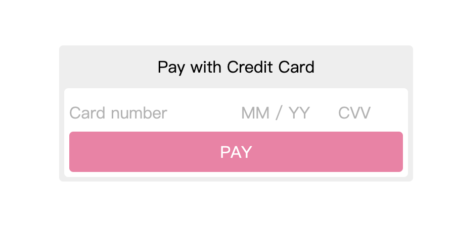
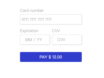
Examples Checkout
Example Checkout with card Element
Example Checkout with pan, expiration, and cvv Elements
Element Options
All Elements accept a common set of options.
| Option | Type | Description |
|---|---|---|
| placeholder | String or Object | Set custom placeholder for Element. For pan, expiration or cvv Elements this option is a string with the corresponding placeholder value. If the Element is a card this option is an object with the corresponding placeholder value for each input: { cvv: "cvv placeholder", pan: "number placeholder", expiration: "expiration placeholder" } |
| classes | Object (Optional) | Set custom class names on the container DOM element when the Liquido Element is in a particular state. - base - The base class applied to the container. Defaults to LiquidoElement. - complete- The class name to apply when the Element is complete. Defaults to LiquidoElement--complete. - empty - The class name to apply when the Element is empty. Defaults to LiquidoElement--empty. - focus - The class name to apply when the Element is focused. Defaults to LiquidoElement--focus. - invalid - The class name to apply when the Element is invalid. Defaults to LiquidoElement--invalid. |
| style | Object (Optional) | Customize appearance using CSS properties. Style is specified as an object for any of the variants below. - base, base style - all other variants inherit from this style. - complete, applied when the Element has valid input. - empty, applied when the Element has no customer input.- invalid, applied when the Element has invalid input. For each of the above, the properties below can be customized. - color - fontFamily - fontSize - fontStyle- lineHeight, to avoid cursors being rendered inconsistently across browsers, consider using padding on the Element's container instead.- letterSpacingThe following pseudo-classes and pseudo-elements can also be styled with the above properties, as a nested object inside the variant. - :hover - :focus - ::placeholder |
| secureCvv | Boolean (Optional) | Controls CVV visibility. true masks input, false shows plain text. |
element.mount(domElement)
You need to create a container DOM element to mount an Element.
The element.mount() method attaches your Field to the DOM. element.mount() accepts either a CSS Selector (eg: '#card-element') or a DOM element.
element.addEventListener(event, handler)
The only way to communicate with your Element is by listening to an event. Elements might emit any of the events below. All events have a payload object that has an element property with the type of the Element that emitted the event.
| Event | Description |
|---|---|
| blur | Triggered when any of the elements loses focus. The event payload always contains certain keys:empty - Boolean - true if the value is empty.complete - Boolean - true if the value is well-formed and complete. -- complete can be used to progressively disclose the next parts of your form or to enable form submission. -- complete is not an indicator of whether a customer is done with their input — it only indicates that the Element contains a complete, well-formed value.error - The current validation error, if any. Comprised of message, code, and element set to validation_error. The error is returned only when the field is not empty and fails validation.element - String - The name of the field that triggered the event: pan, expiration, cvv.hasFocus - Boolean - true if any of the Elements has focus (always false in pan, expiration and cvv elements). |
| focus | Triggered when any of the elements gains focus. The event payload always contains certain keys:empty - Boolean - true if the value is empty.complete - Boolean - true if the value is well-formed and complete.-- complete can be used to progressively disclose the next parts of your form or to enable form submission.-- complete is not an indicator of whether a customer is done with their input — it only indicates that the Element contains a complete, well-formed value.error - The current validation error, if any. Comprised of message, code, and element set to validation_error.element - String - The name of the field that triggered the event: pan, expiration, cvv. |
| error | Triggered when a client-side validation error is detected. The event payload always contains an error key which contains the current validation error. Comprised of: message, code and element, set to validation_error. |
| complete | Triggered when the Element changes its complete status. The event payload always contains a complete - Boolean - key, which is true when the Element is complete and well-formed, and false otherwise. |
| empty | Triggered when the Element changes its empty status. The event payload always contains an empty - Boolean - key, which is true when the Element is empty, and false otherwise. |
| ready | Triggered when the Field is mounted and loaded in the DOM. |
| change | Triggered when any of the following values changes to the Element. The event payload always contains certain keys, in addition to some element-specific keys.empty - Boolean - true if the value is empty.complete - Boolean - true if the value is well-formed and complete.-- complete can be used to progressively disclose the next parts of your form or to enable form submission.-- complete is not an indicator of whether a customer is done with their input — it only indicates that the Element contains a complete, well-formed value.error - The current validation error, if any. Comprised of message, code, and element set to validation_error. The error is returned only when the field meets the required length but fails validation. |
| Error code (number) | Description |
|---|---|
| 1 | The component has not been mounted yet. |
| 2 | The component value is null. |
| 3 | The value of the component fails validation. |
Since the error is returned conditionally, you can manually validate the component value using the complete and empty boolean flags, which are always included in each event.
Input validation
Elements validates customer input as it is typed. To help your customers catch mistakes, listen to change events on the Element and display any reported errors:
card.addEventListener('change', (event) => {
    const errorEl = document.getElementById('form-item__error--card');

    errorEl.textContent = event.error
        ? event.error.message
        : '';
});
Other Methods
| Method | Description |
|---|---|
| blur() | Blurs the Element. |
| clear() | Clears the value(s) of the ELement. |
| destroy() | Removes the Element from the DOM and destroys it. Note: a destroyed Element cannot be re-activated or re-mounted to the DOM. |
| focus() | Focuses the Element. In a card Element it will focus on the pan field. |
| unmount() | Unmounts the Field from the DOM. Call element.mount() to re-attach it to the DOM. |
| update(options) | Updates the options the Elements was initialized with. Accepts the same options as elements.create(). |
The styles of an Element can be dynamically changed using update(). This method can be used to simulate CSS media queries that automatically adjust the size of Elements when viewed on different devices.